
Many Journeys, One New Foundation
Since 2007, this privately run project has documented extraordinary independent journeys around the world. Once a year, its travellers set off for around ten weeks, exploring different destinations, routes and ways of getting around. Each journey tells a story of its own, gradually growing into a collection of travel reports, photographs, maps and detailed travel information.
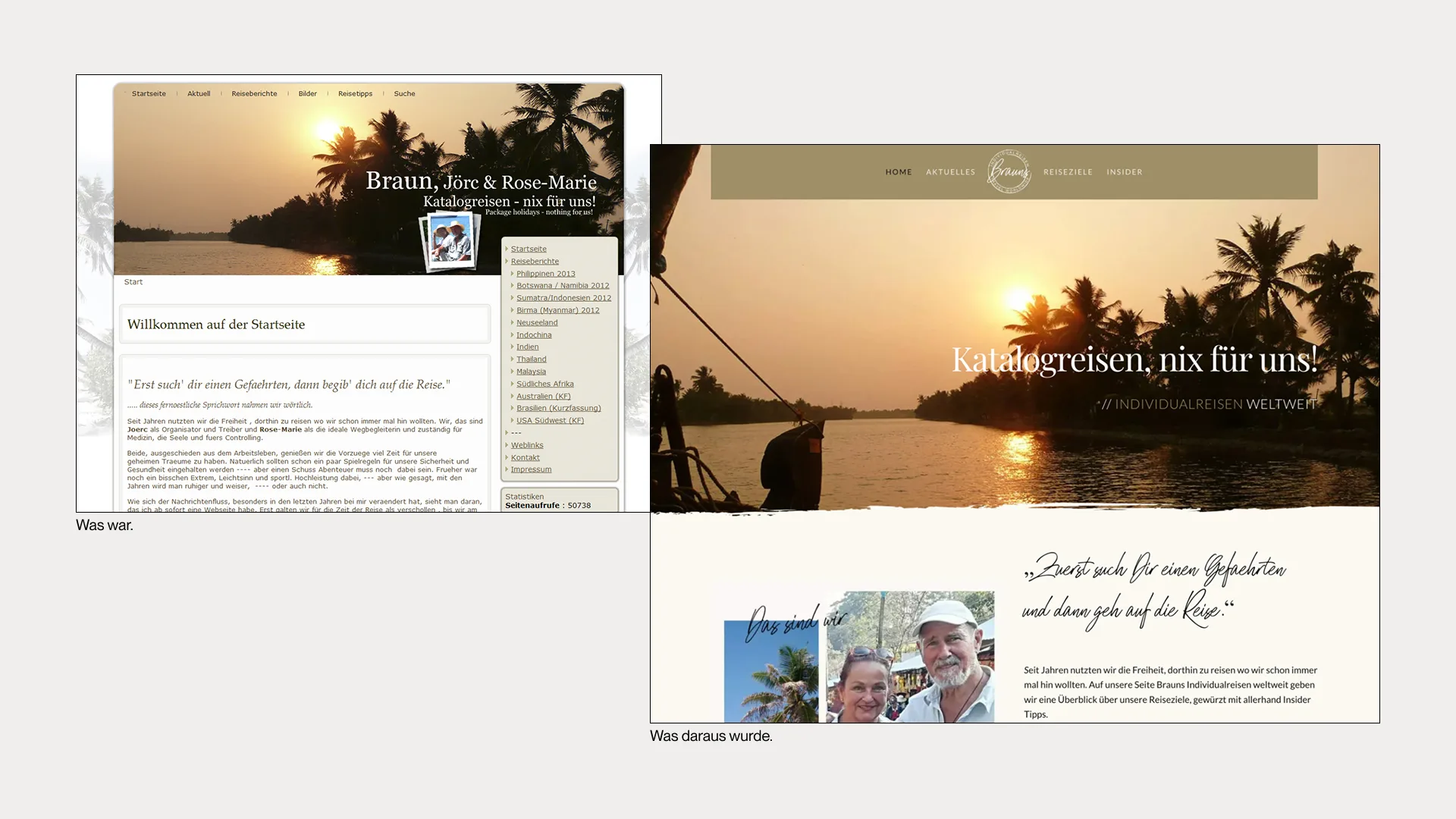
By the time the website was redesigned in 2019, the archive already contained 18 journeys, each with four to six travel reports, galleries, route maps and additional information pages. Technically, the website was still running on Joomla. What had worked well for years was becoming increasingly difficult to manage as the archive expanded. Its structure no longer reflected the nature of the project either.
The redesign therefore became an opportunity to rethink the entire website. All existing content was first transferred to a parallel WordPress installation, reorganised and brought together in a new system. Instead of placing individual blog posts at the centre, the structure would now revolve around each journey as a whole.
Giving Every Journey Its Own Space
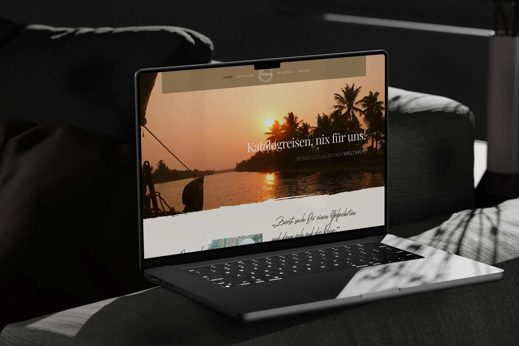
Alongside the technical restructuring, the project received an entirely new visual identity. The website was intended to feel less like a conventional travel blog and more like the journeys themselves: individual, personal and presented with a certain attention to detail.
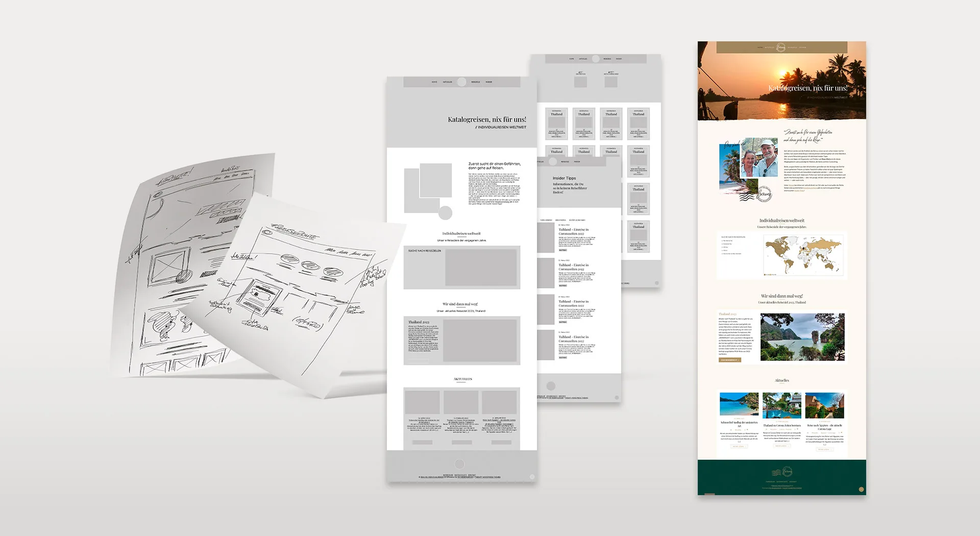
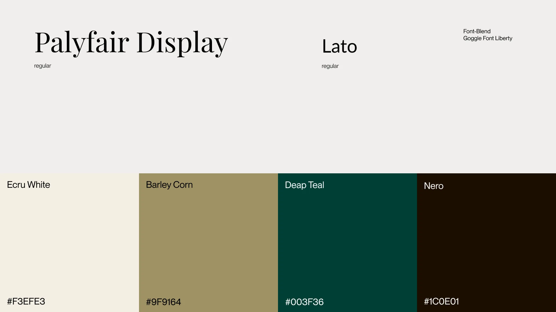
Colours, typography and layout grids were developed from scratch, creating a calmer, more refined visual language. Initial hand-drawn ideas gradually evolved through wireframes and page concepts into a working prototype.
The aim was not to reinvent the design for every destination. Instead, we created a consistent framework that gives very different journeys and visual worlds enough room to retain their individual character.
The Journey, Not the Blog Post
A traditional blog organises its content primarily by date. For this project, that was precisely the wrong approach. A ten-week journey consists of numerous individual reports, but together they tell a single story.
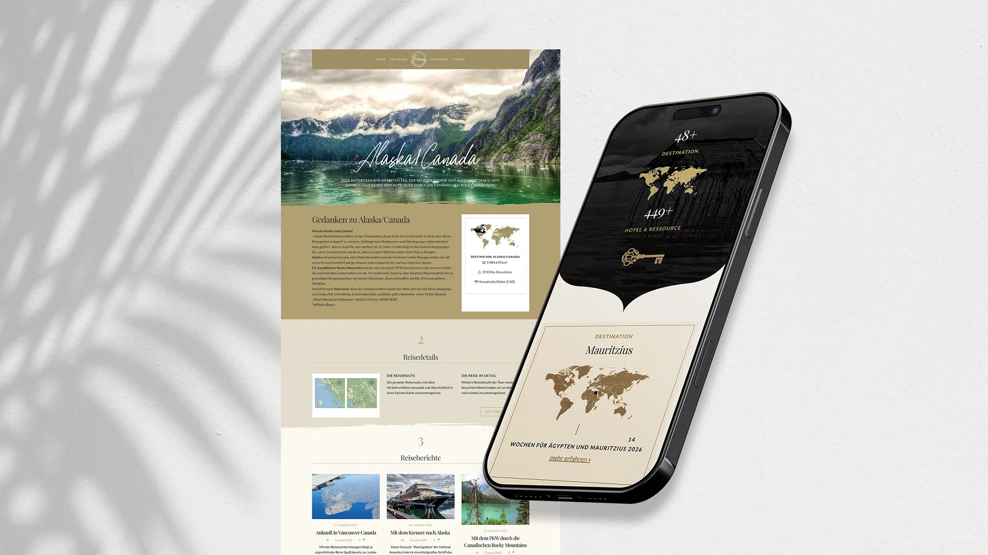
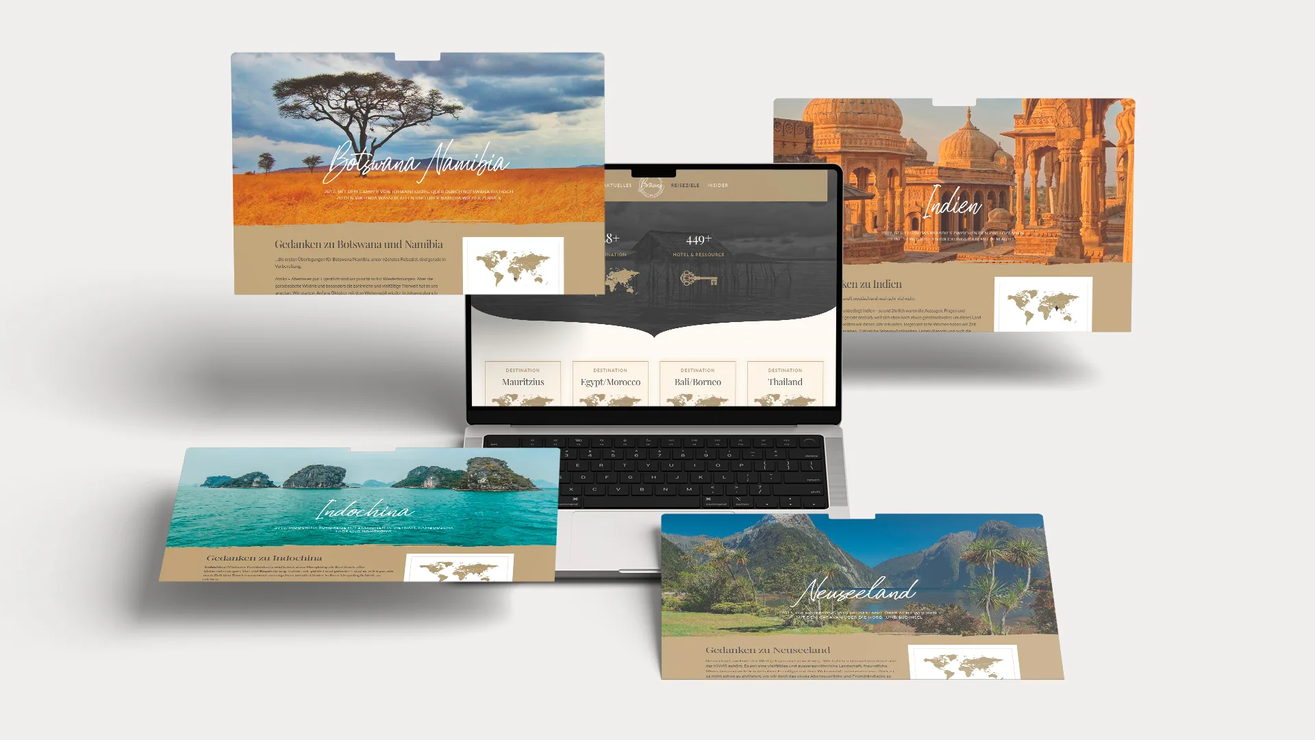
The redesign therefore introduced a dedicated content architecture. The “Destinations” section leads visitors to individual journeys, each with its own central overview page. This is where all the related material comes together: travel reports, photo galleries, custom route maps and a structured summary of the most important stops and travel details.
What had previously been a chronological collection of blog posts became 18 individual travel documentaries. New journeys can now be added using the same structure, without older adventures gradually disappearing further down the timeline.
The new architecture was complemented by a “Latest” section for shorter articles outside the main journeys, along with “Travel Tips”. Here, experiences and insights gathered along the way offer practical advice that goes beyond the travel stories themselves.
A Distinctive Visual Signature
As part of the redesign, the project also received its own visual mark. It brings the website’s design language together in a compact, recognisable symbol, giving a project that has grown over many years a consistent identity.
The branding was never intended as a separate decorative element. The mark, typography, colour palette and page layouts work together to create a familiar framework for destinations that could hardly be more different from one another.

Making the Journey Visible
One distinctive feature has been part of the project almost from the beginning: every major journey receives its own custom route map.
When the first journeys were documented, the available online mapping services offered very little flexibility for presenting complex travel routes in a visually appropriate way. Simply reproducing existing maps was not an option either, particularly where copyright and usage rights were concerned.
The solution was developed entirely in our own studio. Map material, routes, stops and different modes of transport are combined into individual travel graphics. Especially on extended journeys involving flights, boat trips, railway routes and numerous changes of location, these maps reveal at a glance what would otherwise be scattered across many separate travel reports.
Since then, almost every new journey has been accompanied by at least one custom map. Their visual style has evolved and become more refined over the years, but the underlying idea remains unchanged. Long since more than a practical addition, the maps have become a recurring visual feature and an integral part of the project’s identity.

A Journey That Continues Behind the Scenes
The move to WordPress in 2019 also meant a complete renewal of the website’s technical foundation. Performance, security and easier content management were just as important to the redesign as the new visual language and content structure.
But the project was never intended to be finished at that point. New journeys are added, the archive continues to grow, and technical requirements change. The website is therefore regularly maintained, refined and adapted to new circumstances.
For a project whose documented history now stretches back almost two decades, this ongoing development is an essential part of the concept. The technology provides a reliable framework while leaving room for the website to evolve, rather than treating any particular version as the final destination.

