A Project in Two Stages
The first ideas for a website redesign emerged back in 2022. During this initial phase, we developed the basic structure, explored early design concepts and set up a technical testing environment. As the work progressed, however, it became clear that the project was more extensive than originally anticipated. Requirements became more specific, other communication priorities took precedence, and the website project was temporarily put on hold.
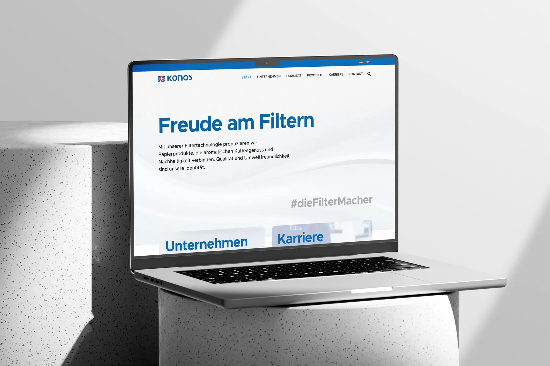
The project resumed in late 2024. What we had learned during the first phase became the foundation for a revised concept. Rather than simply continuing with the original design, we reconsidered the entire structure and developed a more consistent visual direction.
This marked the beginning of the website as it exists today.
A Grid as a Design Principle
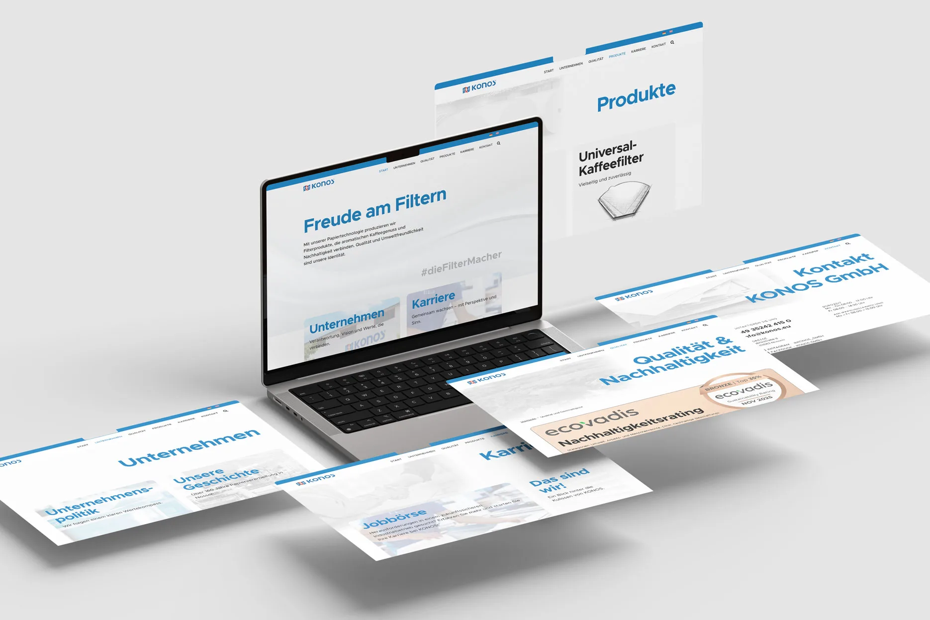
At the heart of the new design is a modular Bento grid. By combining areas of different sizes, the layout allows text, imagery, information and calls to action to be arranged flexibly while maintaining a clear and recognizable structure.
This approach proved particularly suitable for the wide variety of content. A company’s history calls for a different presentation than a product overview, a careers page or information about quality management. Instead of forcing every page into the same layout, we developed a system of recurring elements that allows each subject to find its own balance.
As more substantial content became available in early 2025, the system gradually took shape. Sections covering quality, careers and contact were developed, additional pages were built from the ground up, and existing content was transferred into the new structure.
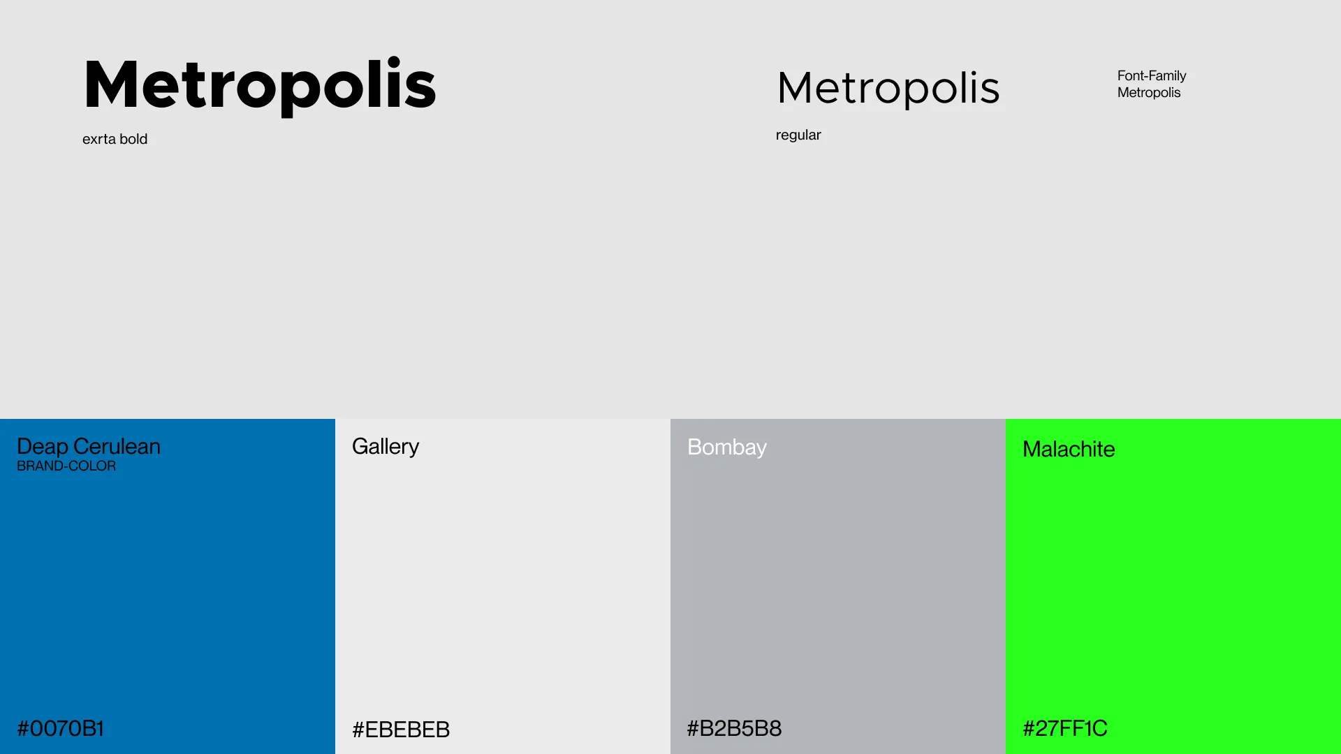
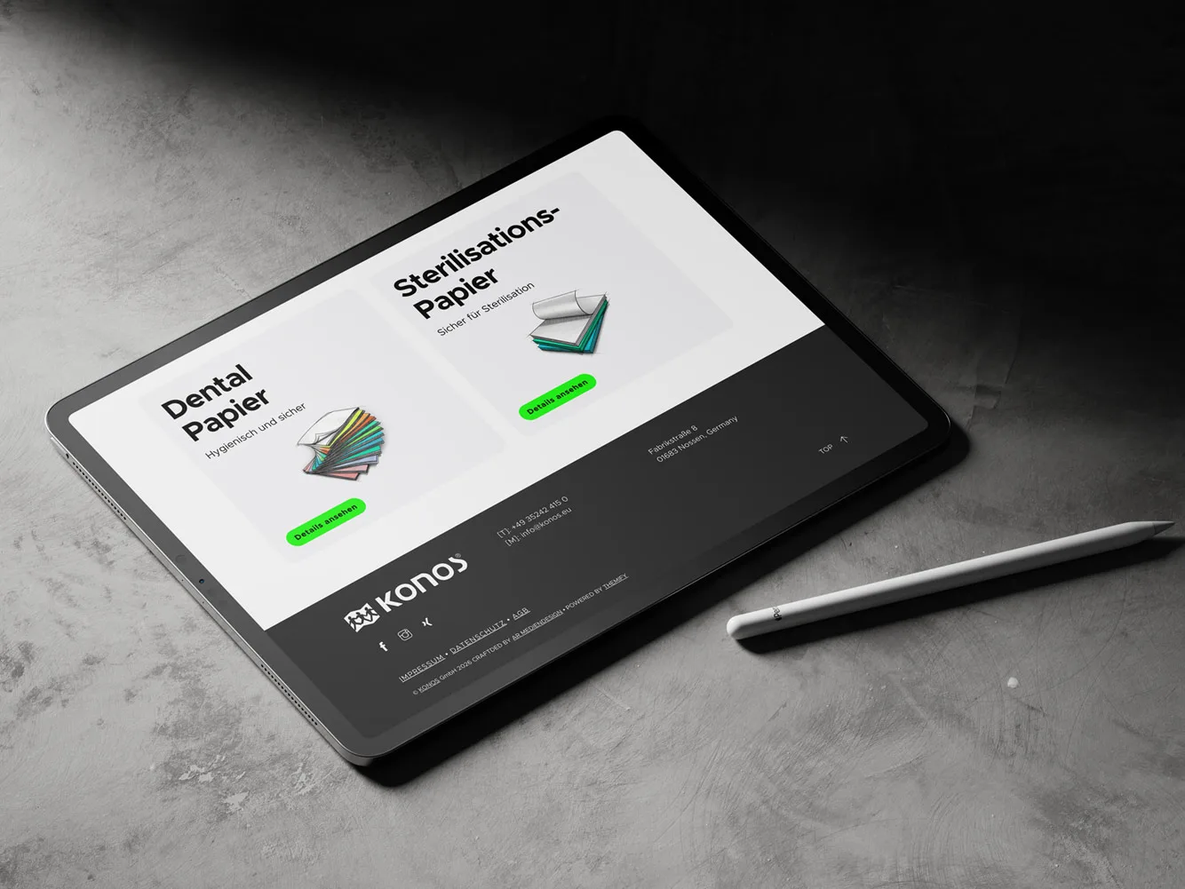
The design continued to evolve alongside the actual content. Typography, spacing, surfaces, gradients and colours were repeatedly reviewed in context. Eventually, a vibrant green emerged as the defining accent colour, giving the website a distinctive and recognizable identity.
Products Between Drawing and Reality
Presenting the products was a particular design challenge. Filter bags and speciality papers are functional products, but they do not immediately lend themselves to a distinctive visual presentation on a corporate website.
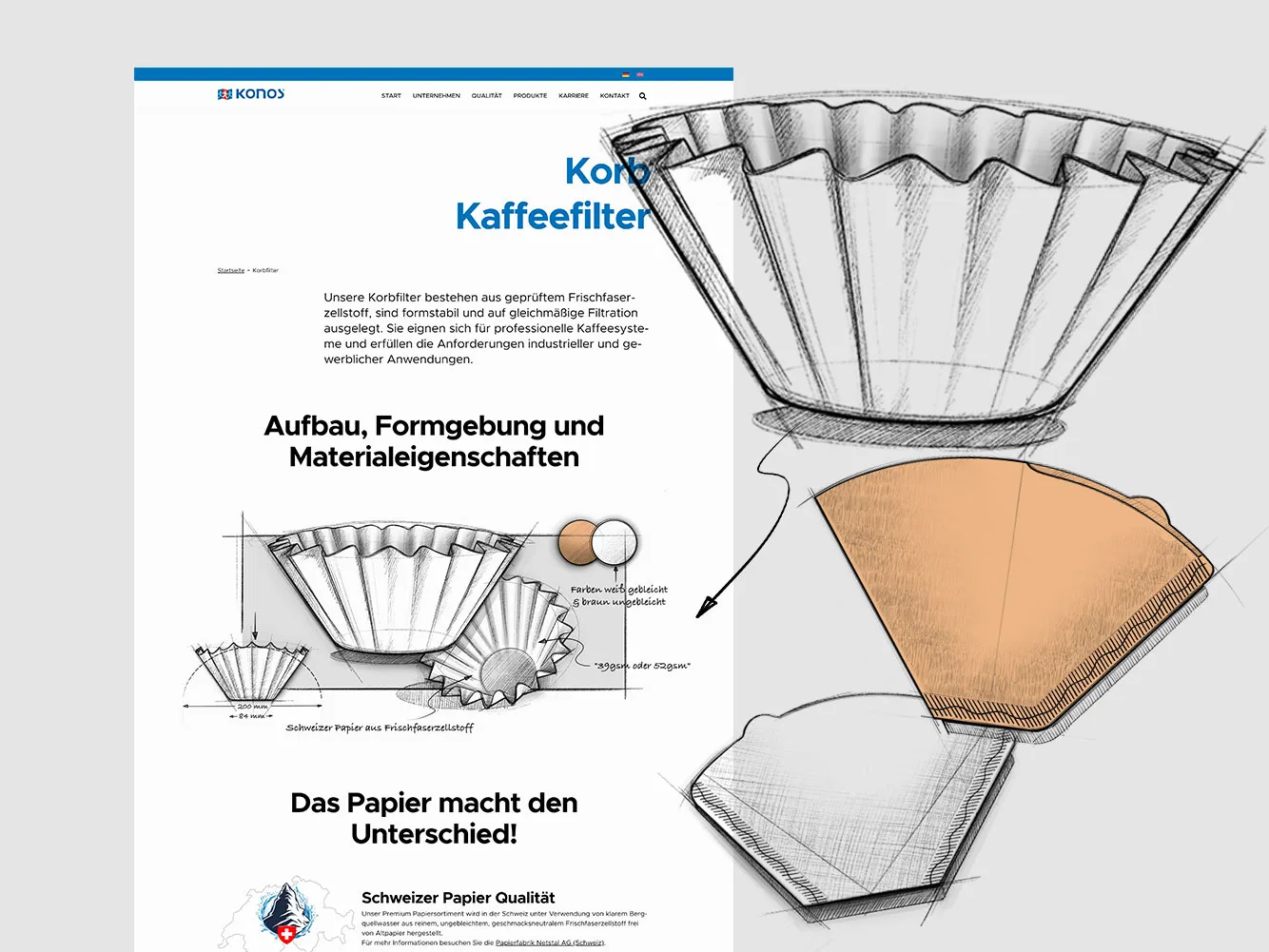
Rather than relying entirely on conventional product photography, we developed a different visual approach. The products are presented as collages combining drawings, sketches and technical elements, deliberately reminiscent of the early stages of a design process.
Suitable references were researched, initial drawings created and gradually refined into a coherent visual language.
These illustrations give the product sections a character of their own, combining technical precision with a more expressive design approach. At the same time, they established a visual language that could extend well beyond the website itself.
When Design Calls for Its Own Tools
As the design became more refined, the technical requirements grew alongside it. Responsive typography was made more dynamic, the Bento elements on overview pages received carefully considered hover and motion effects, and existing components were replaced whenever they reached their design or technical limitations.
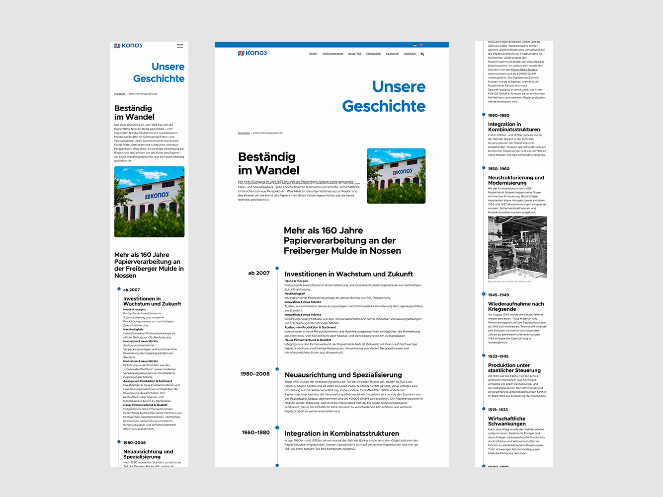
One example is the company timeline. The original timeline solution proved too restrictive, particularly on mobile devices. It was eventually replaced by a custom-built module that brought content, visual design and responsive behaviour together with far greater precision.
Managing and reviewing the increasingly extensive content also called for a dedicated technical solution. For the final round of revisions, a direct feedback system was integrated into the website. Comments on wording, spelling, units of measurement or individual visual elements could be placed exactly where they were relevant, then collected and addressed systematically.
Over the course of the project, the work therefore produced more than a collection of new pages. It also led to individual solutions developed directly in response to the project’s specific needs.

Two Languages, One Website
Once the German content was complete, the English version became the final major stage before launch.
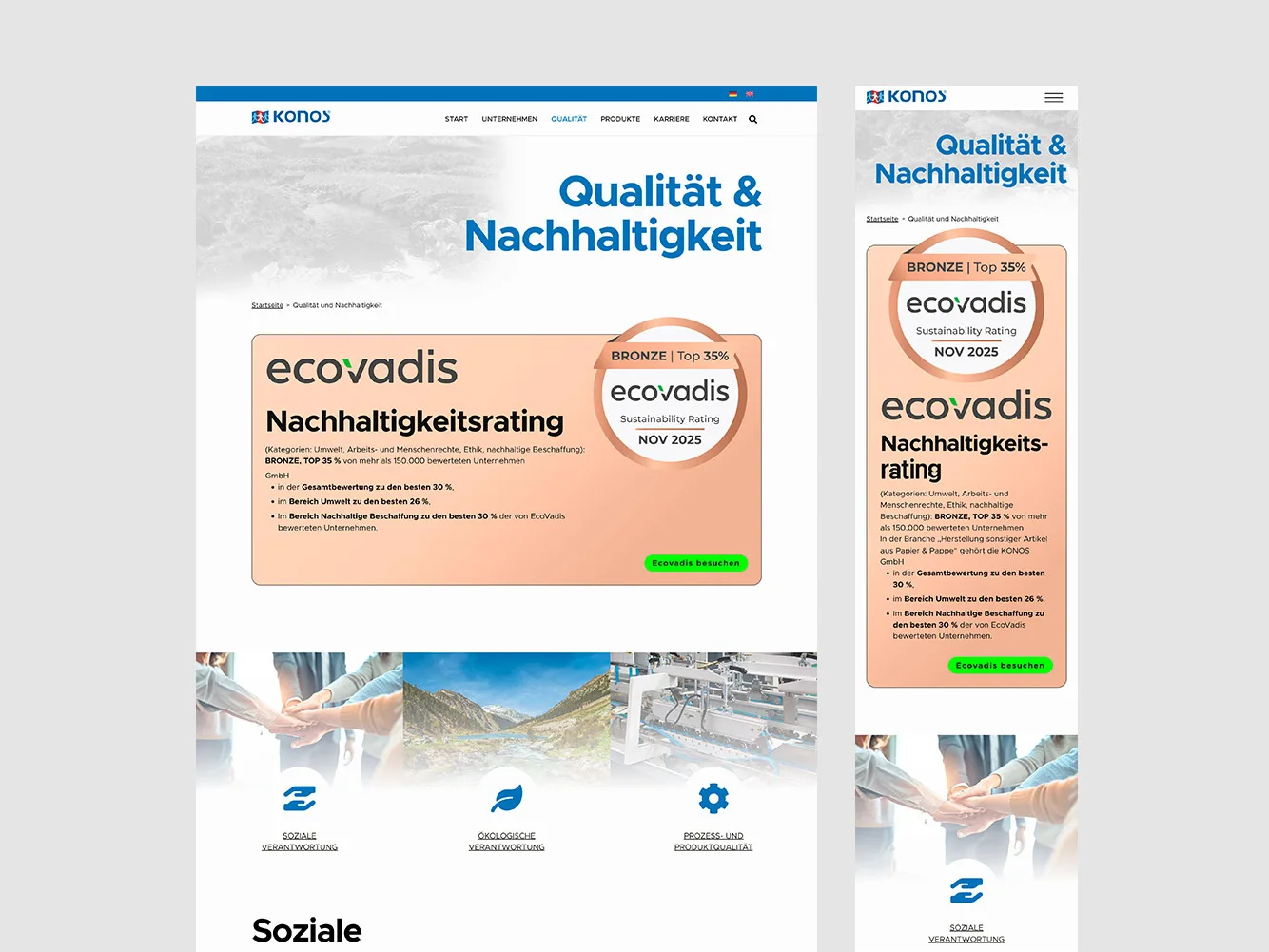
The entire website structure was adapted to support both languages. Navigation, varying text lengths and individual page elements all required attention, as did content that had to follow specific wording requirements.
Automated translation helped manage the substantial amount of content, while the structure and visual design remained consistent across both language versions.
The result was a website that also reflects the company’s international outlook.

Going Live Is Not the Finish Line
The new website finally went live in autumn 2025. It replaced the previous site, the prepared domain structure was switched over, and additional security measures were implemented during the final stages of the project.
The website has been maintained and developed continuously ever since. Technical updates, adjustments to changing legal requirements, current job vacancies and smaller refinements to the design and translations are all part of this ongoing work.
Because a web project of this scale does not end the moment it goes live. It is used, it changes, and over time it faces new demands. Its technical foundation must not only accommodate these developments, but remain capable of supporting them for years to come.

Individual applications became a coherent whole.
Structure became form – and form became impact.
Some Ideas Go Beyond the Screen
The work on the website did not stop at the digital presence. In particular, the visual language developed for the product sections prompted a fresh look at existing communication materials beyond the web.
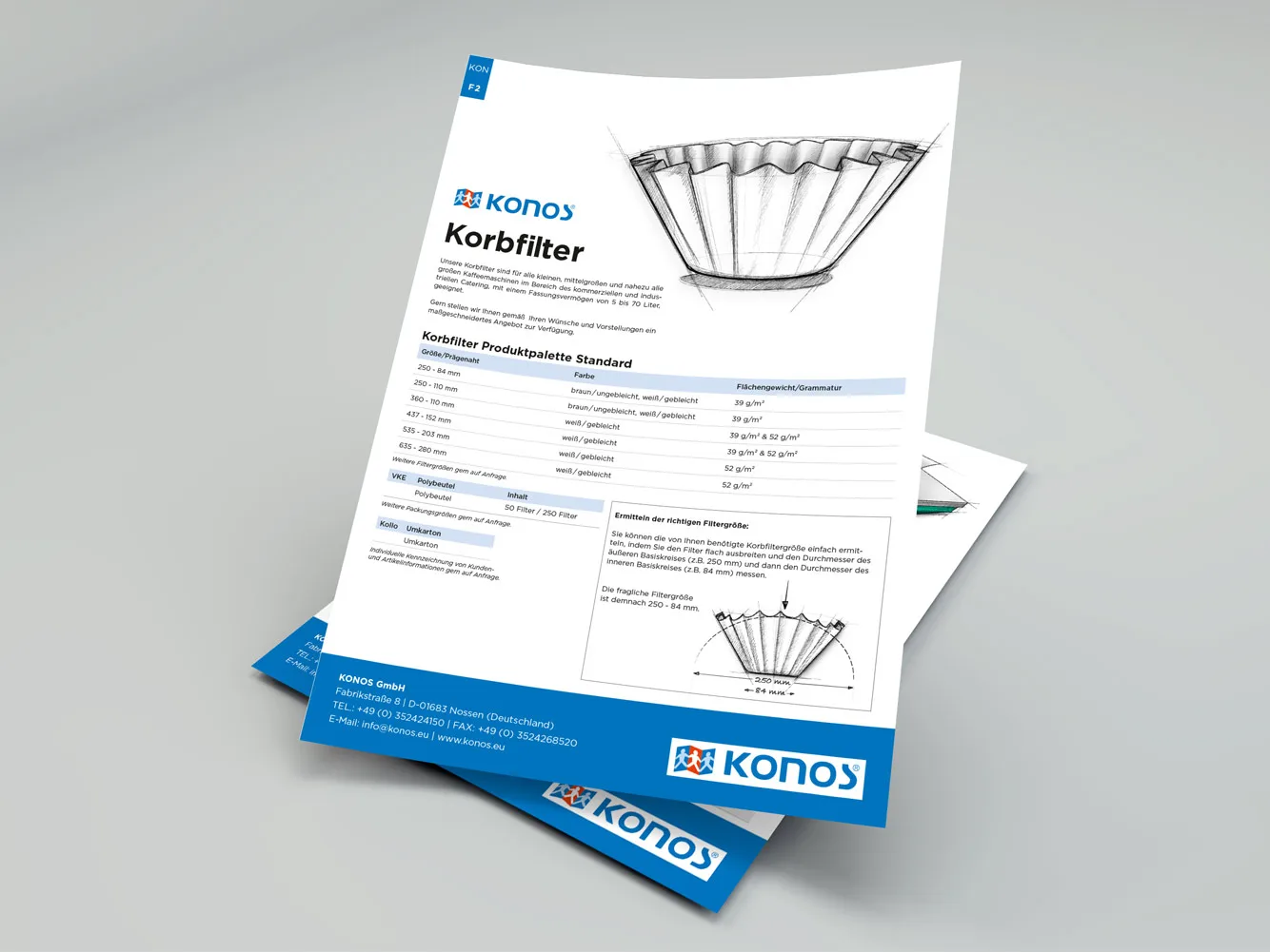
The existing product sheets were redesigned and brought into a consistent visual framework. Typography, colour, information hierarchy and the new product illustrations all followed the principles originally established for the website.
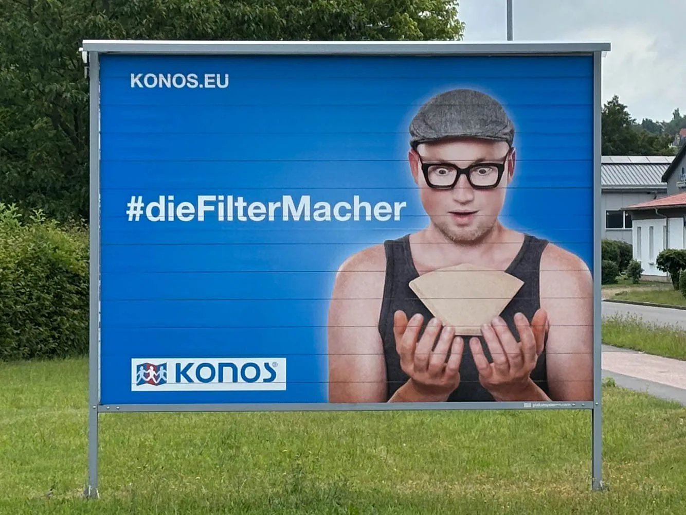
Over the years, further applications followed. These included flyers and posters for recruitment campaigns, graphic elements for the company’s stationery and business materials, and content for various social media channels. One particularly demanding design task was the packaging redesign for the company’s own brand, EMMA. Each of these projects came with its own requirements, yet all built upon the visual language already established.
What had originally been developed for a screen became a unifying design principle across a wide range of applications. Not a corporate identity defined after the fact, but a design system that had grown naturally out of the work itself.